
Complicated navigation
Users feel overwhelmed by too many pages and unclear menu structures
Overview
Type: Academic UX Project
Role: UX Designer
Duration: [9/28/2025 - 12/1/2025]
Tools: Figma
Problem
Small Bed & Breakfast websites often fail to convert visitors into bookings due to cluttered navigation, incomplete room information, and confusing reservation processes. Users struggle to quickly understand pricing, compare rooms, and confidently complete a booking.
Research
Research was conducted through competitive analysis, user personas, and usability testing.
Research included:
Competitive audit of platforms like Airbnb, Vrbo, and TripAdvisor.
Persona development.
User journey mapping.
Usability testing.
Key insights:
Simplicity and trust matter more than features.
Users prioritize clarity, pricing visibility, and ease of booking over advanced functionality.Speed vs. clarity tradeoff.
Some users (Jason) want fast booking, while others (Linda) need reassurance and detailed information.Industry standard = clarity + filtering + trust signals.
Competitors succeed because they provide:Reviews.
Pricing transparency.
Structured flows.
Booking flow is the highest-risk drop-off point.
If unclear → user leaves.
Pain Points
Incomplete or unclear room details
Guests want pricing, photos, and amenities immediately — not buried
Confusing booking process
Long or unclear forms lead to drop-offs before completion
Final Design
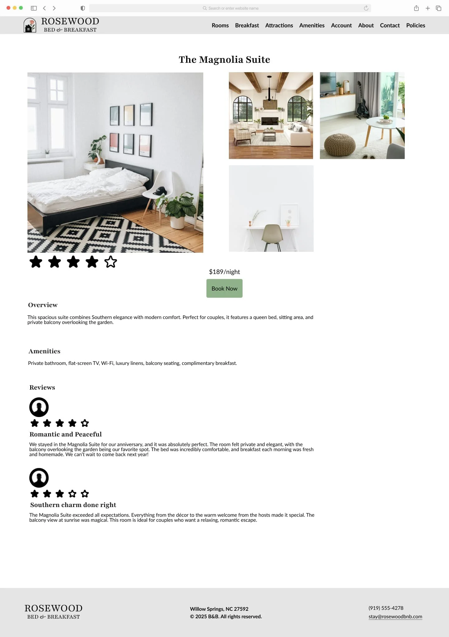
The final design focuses on clarity, hierarchy, and trust.
1. Strong Call-to-Action.
Consistent green “Book Now” button.
High contrast for visibility.
Supports fast decision-making.
2. Design System Consistency.
From your style guide:
Typography: Playfair (elegant) + Lato (readable)
Color palette: warm, natural tones → builds trust and calmness.
Buttons + inputs: consistent styling across pages.
This creates a cohesive brand experience, not just screens.
3. Structured Booking Flow.
From your wireframes + sitemap:
Flow:
Home → Rooms → Room Details → Booking Form → Confirmation.
And your wireframes show:
Simplified layout.
Clear booking button placement.
Reduced cognitive load.
Reflection
This project highlighted that good design is not about adding features, but removing friction.
Key Improvements:
Simplified booking experience by restructuring the flow from room selection to reservation.
Improved layout efficiency by reducing empty space and optimizing content placement
Enhanced information clarity by prioritizing pricing, room details, and key amenities.
Increased visual consistency across pages through standardized components and spacing.
Strengthened call-to-action visibility to guide users toward booking decisions.
One key insight was that users don’t need more options — they need:
Clarity.
Trust.
Speed.
Even small improvements — such as:
Adding visible pricing.
Improving spacing.
Simplifying navigation.
This had a significant impact on usability and perceived trust.
What I Learned:
This project reinforced that users approach booking decisions differently. Some users are fast decision-makers, while others need more time and reassurance. The design needed to support both without overcomplicating the experience.
I also learned that content placement directly affects decision-making. When key information is not immediately visible, users lose confidence and are more likely to abandon the process.
Next Steps:
Refine mobile responsiveness for smoother booking interactions.
Improve visual hierarchy across all pages.
Add subtle feedback interactions (hover states, transitions).
Conduct usability testing to validate booking flow improvements.
Prototype Link
Lack of visual trust
Outdated or cluttered designs reduce confidence in booking
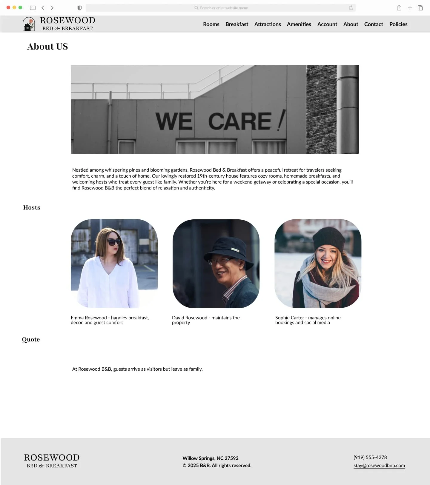

UX/UI design project focused on a responsive, user-friendly platform designed to help guests explore rooms, learn about amenities, view attractions, and book their stay with ease.
Before
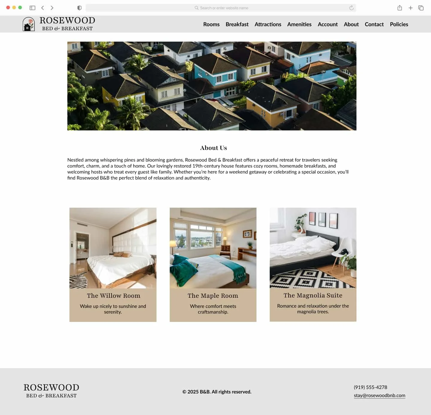
Before:
Only three rooms were displayed on the homepage, creating an incomplete and potentially confusing experience for users.
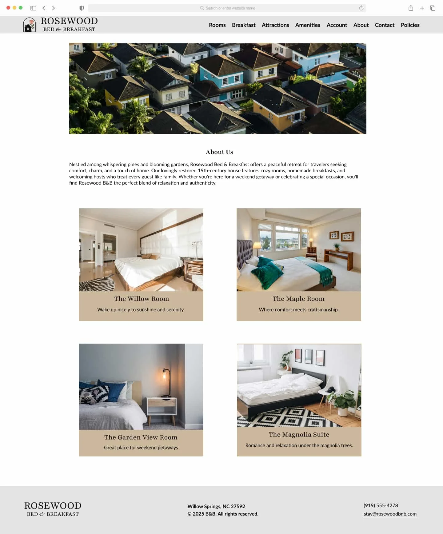
After:
Updated the layout to include all four rooms, providing a complete and consistent overview of available options.
Improvements:
Improved content completeness and user trust by ensuring all offerings are clearly visible without missing information.
Improvements
After