
Lack of local content
Most rugby platforms focus on international teams, making it difficult for users to find relevant local content.
Overview
Type: Academic UX Project
Role: UX Designer
Duration: [6/2/2025 - 7/14/2025]
Tools: Figma
Problem
The Austin Rugby Hub was designed to solve the lack of a dedicated, local digital space for rugby fans in Austin. While global platforms like Reddit or major rugby websites provide content, they do not support local community interaction or fan engagement.
Research
Research was conducted through competitive analysis, user personas, and usability testing.
Key insights included:
Users prefer mobile-first, simple interfaces with minimal navigation
Essential features include:
Blog content.
Discussions.
Media sharing.
Event scheduling.
Poorly designed fan platforms often suffer from:
Slow performance.
Cluttered layouts.
Confusing navigation.
Additionally, usability testing focused on key user tasks such as:
Reserving event spots.
Voting in polls.
Uploading content.
The testing revealed that while users could complete tasks successfully, improvements were needed in:
Navigation clarity.
Content structure.
Visual hierarchy.
Pain Points
Overwhelming interfaces
Users reported frustration with messy layouts and too much information, especially on mobile devices
Poor structure
Users struggled to quickly find key features like events, discussions, or media
Final Design
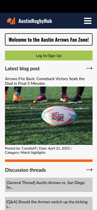
The final design focuses on a clean, mobile-first experience that supports both engagement and usability.
Simplified navigation
A clear structure with main sections such as Blog, Gallery, Discussions, Events, Rugby 101, and Polls ensures users can easily access content
Content prioritization on the home page
Key sections like blog posts, discussions, and events are presented clearly to guide user attention
Consistent UI components
Buttons, cards, and layouts were standardized to improve usability and visual consistency
Community-driven features
Users can:
Post content
Participate in discussions
Vote in polls
Join events
Beginner-friendly content (Rugby 101)
Designed to help new users learn the sport without feeling overwhelmed
The final design balances functionality, clarity, and engagement, making it accessible for both experienced fans and newcomers.
Reflection
Key Improvements:
Improved visual hierarchy to help users prioritize key content like events, blog posts, and discussions
Reduced content clutter by restructuring dense sections into more readable layouts
Standardized spacing and alignment across pages to improve visual consistency
Simplified navigation to make key features easier to access on mobile devices
Key Insights:
A feature-rich platform can quickly become overwhelming if content is not structured properly. Users struggled when all sections had equal visual weight, making it difficult to identify what was most important.
Reducing complexity and organizing content into clear sections significantly improved usability and user focus.
What I Learned
This project taught me the importance of structure over features. Adding more functionality does not improve the experience if users cannot easily navigate or understand the interface.
I also learned that consistency plays a critical role in usability. Small inconsistencies in spacing, alignment, and component design can negatively impact how users perceive the overall quality of a product.
Next Steps
Further refine visual hierarchy across all screens
Improve onboarding and guidance for first-time users
Enhance interactivity with animations and feedback states
Conduct usability testing to validate content structure decisions
Prototype Link
Lack of inclusivity
Many platforms assume prior knowledge of rugby, which discourages beginners
UX/UI design project focused on talking about the team, sharing cool content, and connecting with fellow fans.
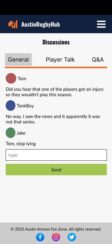
Before
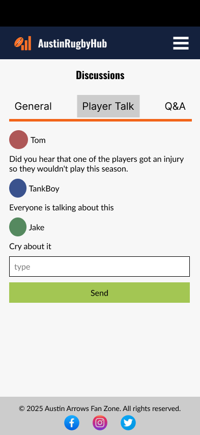
Before:
Excessive white space between the chat messages and input field created a visual disconnect and pushed the typing area too far down.
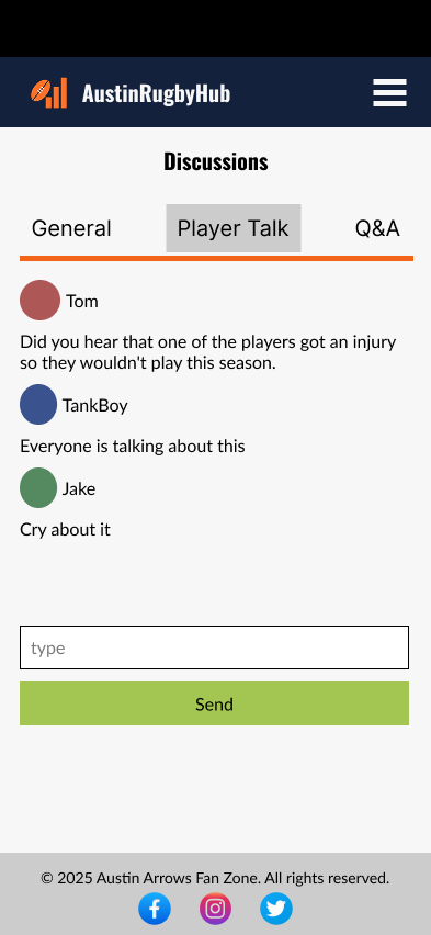
After:
Reduced spacing to bring the input field closer to the conversation, creating a more connected and natural chat experience.
Improvements:
Improved usability by reducing unnecessary scrolling and keeping user interaction elements within immediate reach.
Improvements
After