
Difficulty finding relevant event information
Users struggled to quickly locate event details such as date, time, and availability.
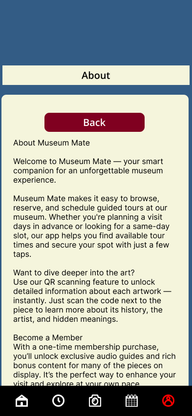
Before
Overview
Type: Academic UX Project
Role: UX Designer
Duration: [10/8/2024 - 4/28/2025]
Tools: Figma
Problem
Museum visitors often struggle to fully engage with exhibitions due to limited access to contextual information and inefficient scheduling tools. While museums provide physical signage, it is often not enough to support deeper understanding or personalized experiences.
Research
Research was conducted through competitive analysis, user personas, and usability testing.
Research was conducted using a combination of:
surveys
moderated usability testing
unmoderated testing (Maze)
preference testing
Key findings included:
High interest in the product concept
Participants showed strong engagement and interest in using the appStrong task success rates
Users were able to complete key tasks like scheduling with a 100% success rate and minimal errorsNeed for clearer structure and labeling
Users experienced confusion with icons, navigation, and feature expectationsTypography impacts usability
Users preferred Open Sans over Lato due to better readabilityFeature value perception matters
While users liked the added features (audio, extra info), they were unsure if they were worth paying for
Pain Points
Unclear navigation and feature expectations
Some users were unsure how to move between sections like events, camera scanning, and profile.
Information overload and poor structure
Users prefer summarized content, but some screens contained too much text or lacked hierarchy.
Final Design
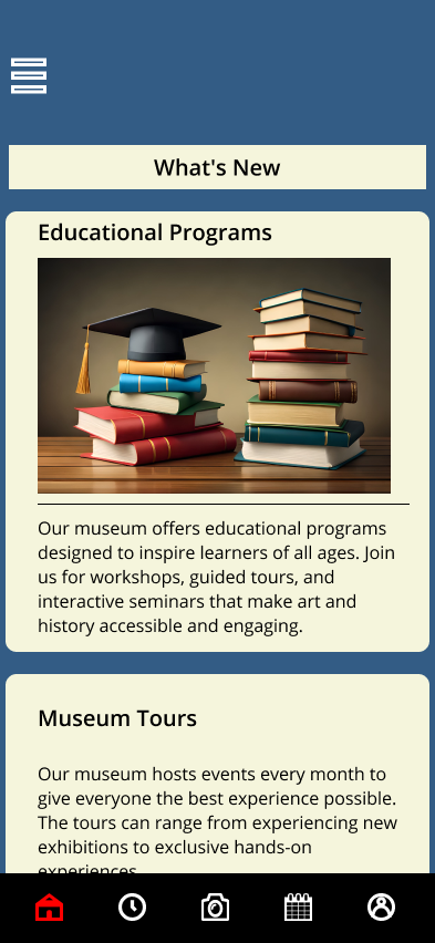
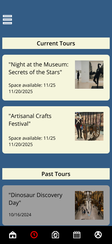
The final design focuses on improving clarity, usability, and engagement while maintaining a clean mobile-first experience.
Key design improvements include:
Improved navigation clarity
Icons and labels were refined to better match user expectations and reduce confusionEnhanced event scheduling flow
The process was simplified to clearly guide users from event selection to confirmationIntegrated QR scanning feature
Users can scan artwork to instantly access detailed descriptions and audio playbackContent hierarchy improvements
Important information is prioritized at the top, with additional details accessible progressivelyConsistency across UI components
Spacing, buttons, and layouts were standardized to improve usabilityAccessibility improvements
Contrast issues (such as icons) were corrected to improve visibility
Before:
Used Inter font, which appeared less readable in longer text sections and reduced overall clarity.
After:
Switched to Open Sans to improve readability, spacing, and visual comfort for longer content.
Improvements:
Improved text readability and user comfort, especially for content-heavy sections.
Before:
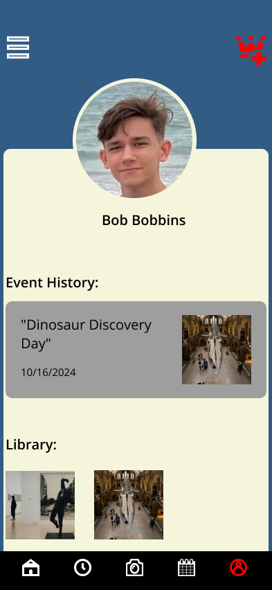
The label “Library” was unclear and did not accurately communicate the purpose of the section.
After:
Renamed to “My Photos” to clearly reflect user-owned content and improve understanding.
Improvements:
Reduced user confusion by using clearer, more intuitive labeling.
Improvements
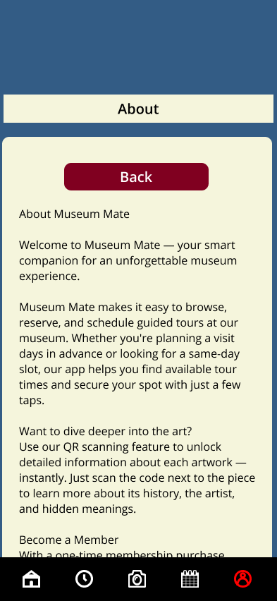
After
Reflection
Key Improvements:
Improved navigation clarity by refining icons and labeling to match user expectations
Simplified event scheduling flow to reduce confusion and improve task completion
Enhanced readability by restructuring dense content into scannable sections
Increased accessibility by improving contrast and visibility of UI elements
Standardized UI components to create a more consistent and predictable user experience
Key Insights:
Users need clear guidance when interacting with unfamiliar environments, especially in informational apps like museum guides. Without clear navigation and labeling, users hesitate and disengage.
Breaking down dense information into smaller, scannable sections made content easier to understand and improved overall usability.
What I Learned:
This project emphasized the importance of accessibility and clarity in user interfaces. Even well-designed visuals can fail if users cannot easily interpret or navigate them.
I also learned that small UI decisions — such as icon clarity, text hierarchy, and spacing — have a significant impact on how users interact with the product.
Next Steps:
Improve onboarding to guide first-time users through app features
Refine interaction feedback (button states, transitions)
Enhance accessibility further (larger tap targets, improved contrast)
Conduct usability testing to validate navigation and flow improvements
Prototype Link
Confusion around icons and functionality
For example, users mistook certain icons (like search) for different functions.
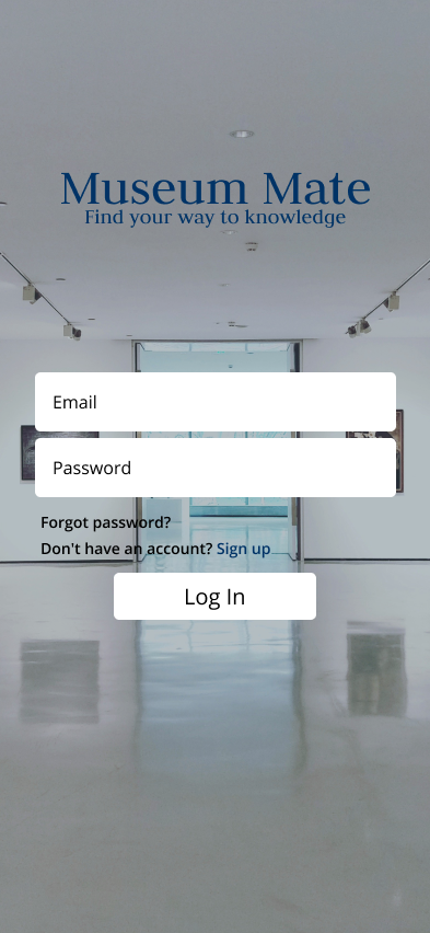
UX/UI design project focused on a public art museum to advertise exhibitions and tours, provide additional museum information to patrons, and enable patrons to schedule tours.
Before

After